Alexander was a project I worked on while at my previous office Tao+Lee in downtown St. Louis. The clients had recently purchased a home in Clayton, MO and were looking to renovate it and make it their own. What started out as a kitchen remodel quickly became a whole home renovation. I really loved working on this project. The clients were great to work with and had excellent taste. They were also open to some of my crazy ideas. The original square shaped home had a large addition that connected the garage and kitchen. Unfortunately, this was done at an angle which created some odd spaces that needed to be rectified. After many design iterations and renderings, it was decided that, in order to make this small galley kitchen into a dream kitchen, relocating the stair to the second level was our best option. (So many people decide to take on kitchen renovations without consulting a designer and simply replace the cabinets and counter tops. Often when they do this, they miss the opportunity to maximize their space and realize it's full potential) What do you think?
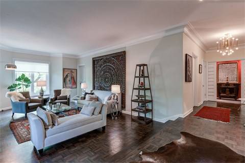
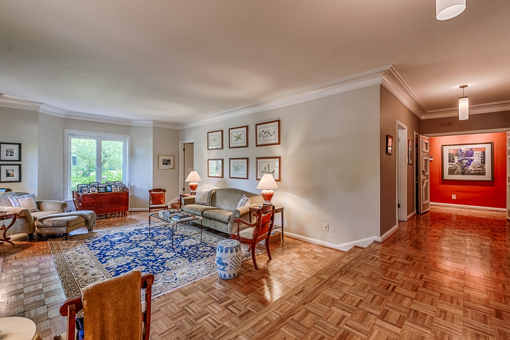
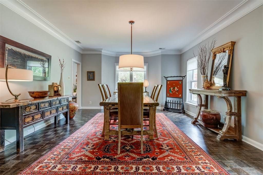
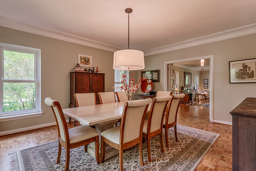
The owners are now ready to take on another fixer-upper and are selling this beautiful home. You can see all of the photos and listing details HERE. Let me know if you would like to schedule a showing!
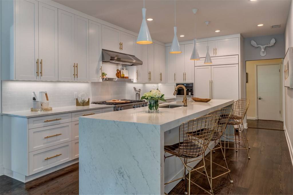
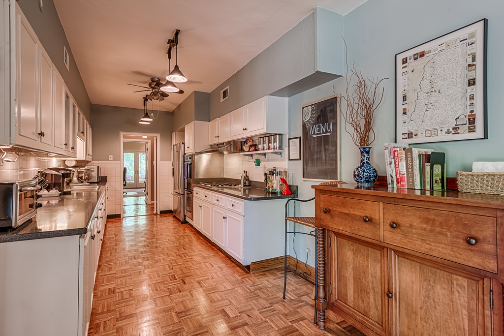


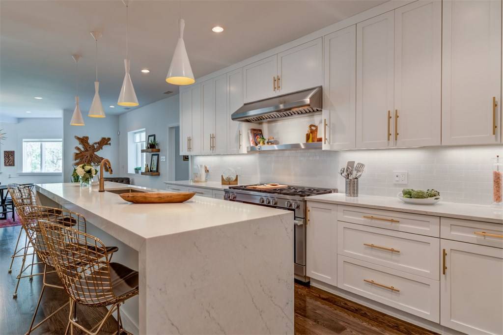
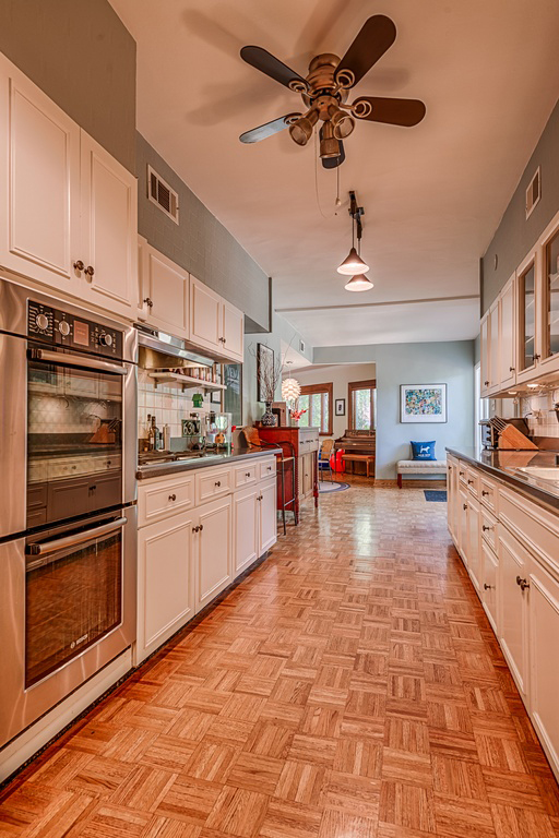
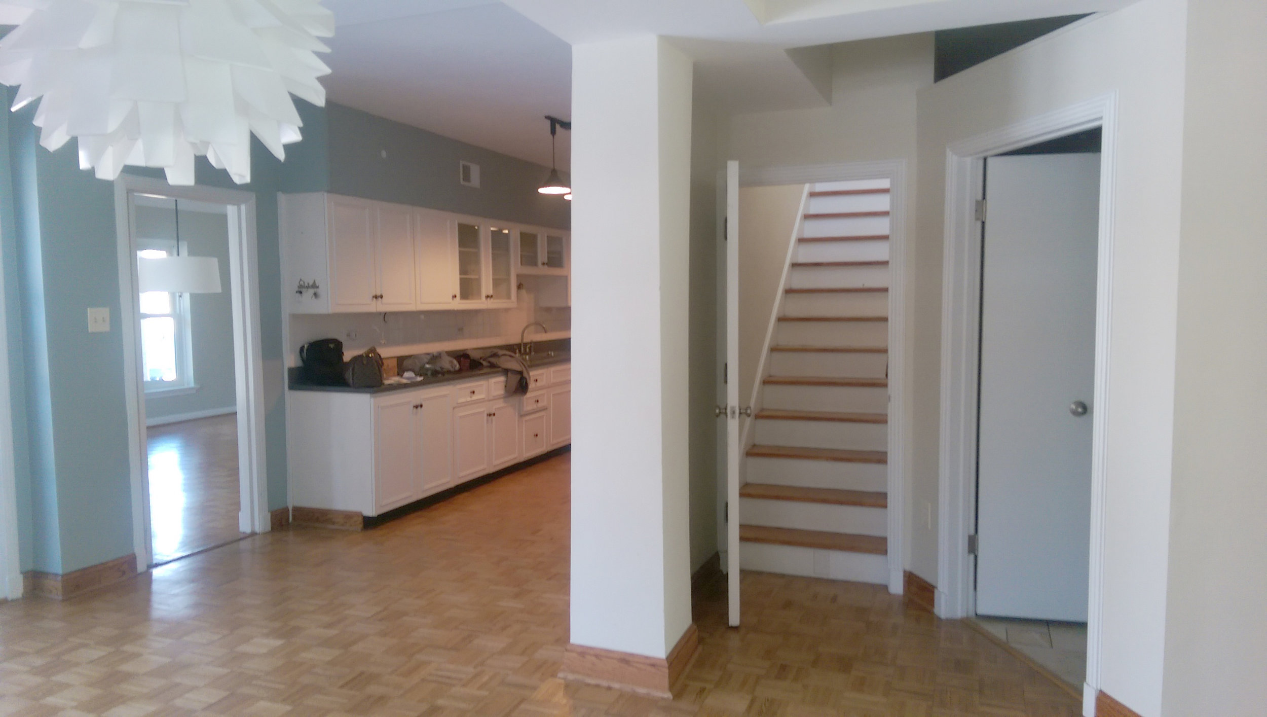
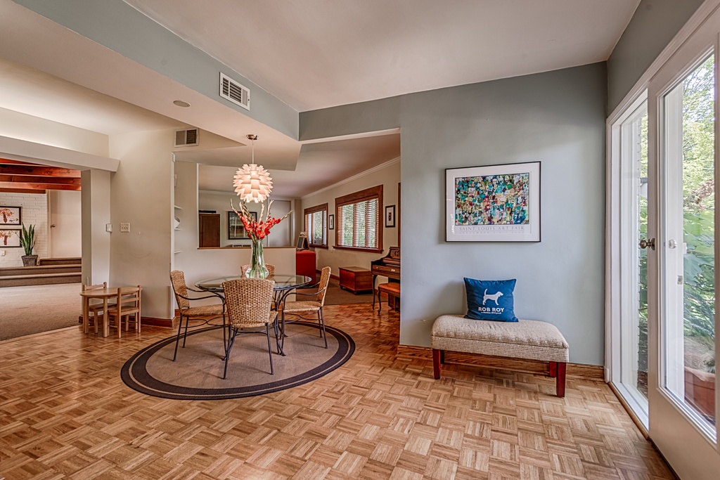
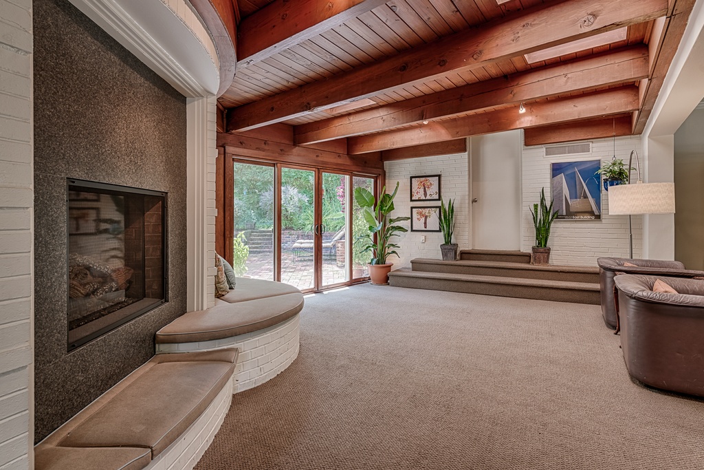
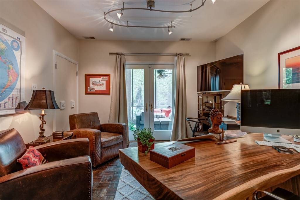
Alright, so here are the details on the kitchen renovation. Honestly, it's been a couple years and I'm hot sure I remember all of the exact finishes and fixtures but I'll provide you with links to items that are replicas to the ones pictured. Before we get into all of the kitchen remodel details, I would like to talk about design strategy for a second. Adding an island was the main goal when determining the layout. As I mentioned earlier, we were able to make space for this by moving the stair roughly 4' to the West. We turned the stair at the bottom, added a CUSTOM HANDRAIL and took over some space from the laundry room. This allowed us to capture additional space for a Pantry. The pantry wall left room for a T.V. niche and art.
Now for the cabinet layout. I generally like to cluster all of the tall cabinets on one wall and have the open counter space and work surfaces clustered on the other wall. This works great, but you always still have that dreaded corner cabinet situation. (This is where working with a custom cabinet fabricator is key. CENTORBI is my go to guy. Everything is locally made in St. Charles, is well priced, and it is top quality.) I generally like to do an awning style cabinet which is perfect for hiding those small appliances. Another option is open shelving or something that looks more like a hutch. All good options but the awning cabinet is simple and clean. Lastly, what cabinets do you need where? Drawers, drawers, drawers! If you can afford them, that is the way to go with your cabinets. A three drawer cabinet nearly doubles your usable storage space and helps keep things more organized. I like to flank the range with single door cabinets that are great for cookie sheet storage and then have a gang of drawers on each side to maximize the storage. Plus I like how hardware looks on large drawers as opposed to doors. Alright, I've kept you hanging long enough. Now for the finishes. (Click on images for links)
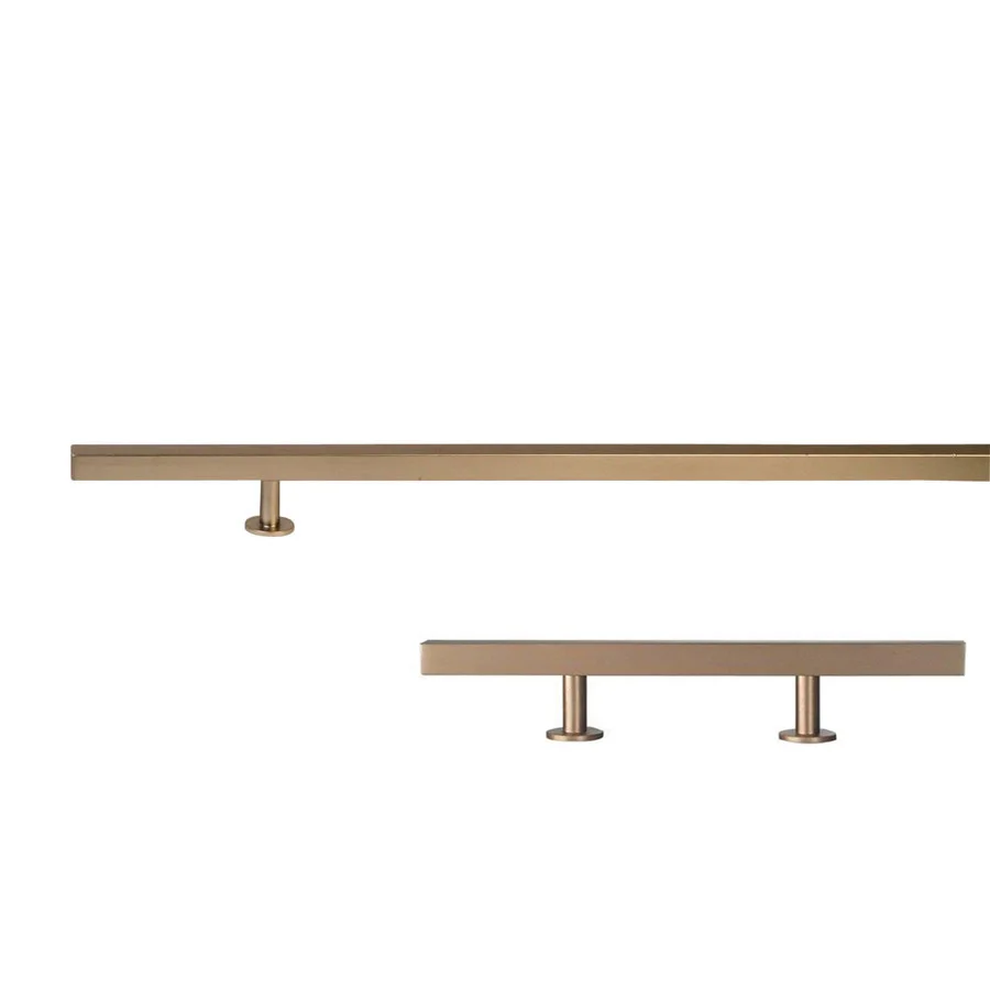
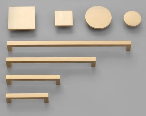
Cabinet Hardware
The cabinet hardware is most similar to these... (left )But if I'm being honest, I really prefer these.... (right)

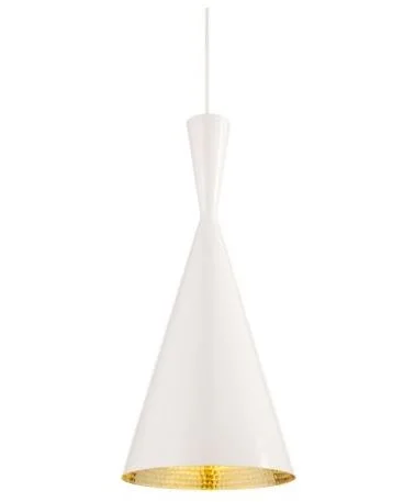
Lighting
Island pendants are by one of my favorite lighting designers, Tom Dixon. If these are out of your budget, you can find a good knock off at WAYFAIR.
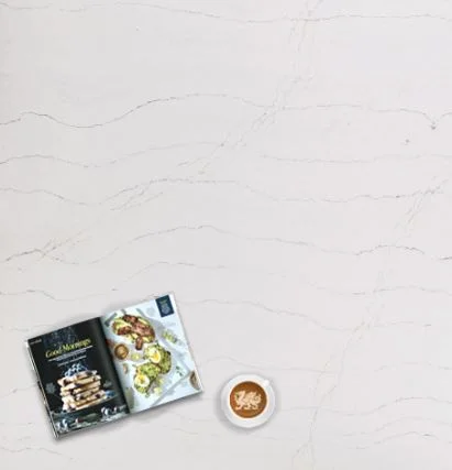
COUNTERS
This is one of those things that I'm not completely sure of but the CAMBRIA Ella is similar to the one shown with its soft veining that is reminiscent of marble without actually looking like marble. Quartz manufacturers have made big strides in the "marble look" options within the last 3 years and there are a LOT more convincing options now days. Like this option on the right from POLARSTONE.
Backsplash

Now the backsplash is something I am sure of. I absolutely love this Savoy tile from ANN SACKS. It comes in a few shades of white with different levels of texture definition. It looks great in an all white kitchen giving the texture needed for a monochrome space. Another great thing about this tile is that it looks completely different with white vs. dark grout.

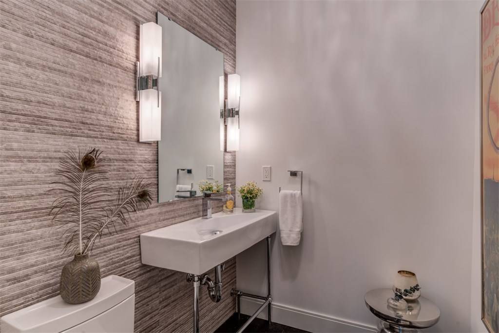
Now for the other parts of the house... The transformation in the powder room was small but mighty. The black tile had to go and was replaced with this beautiful dimensional wall tile from PORCELANOSA and you can find a similar freestanding vanity from POTTERY BARN.
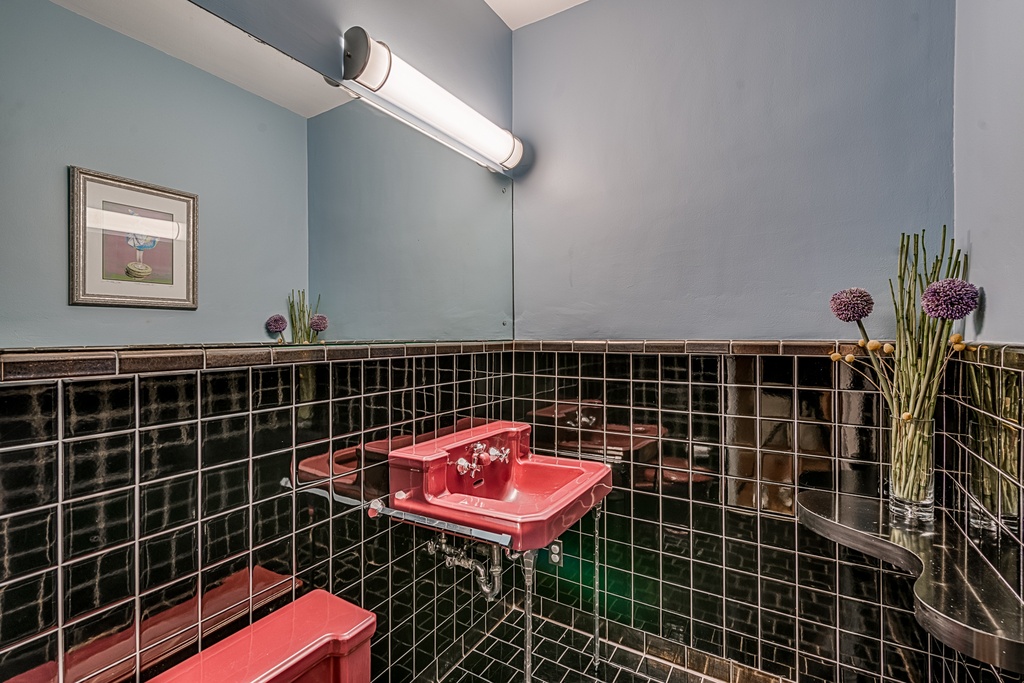
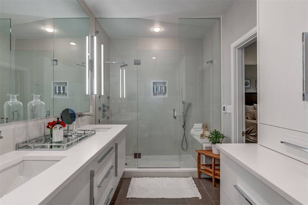
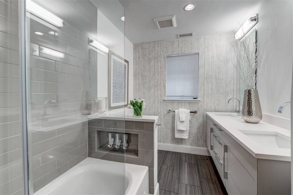
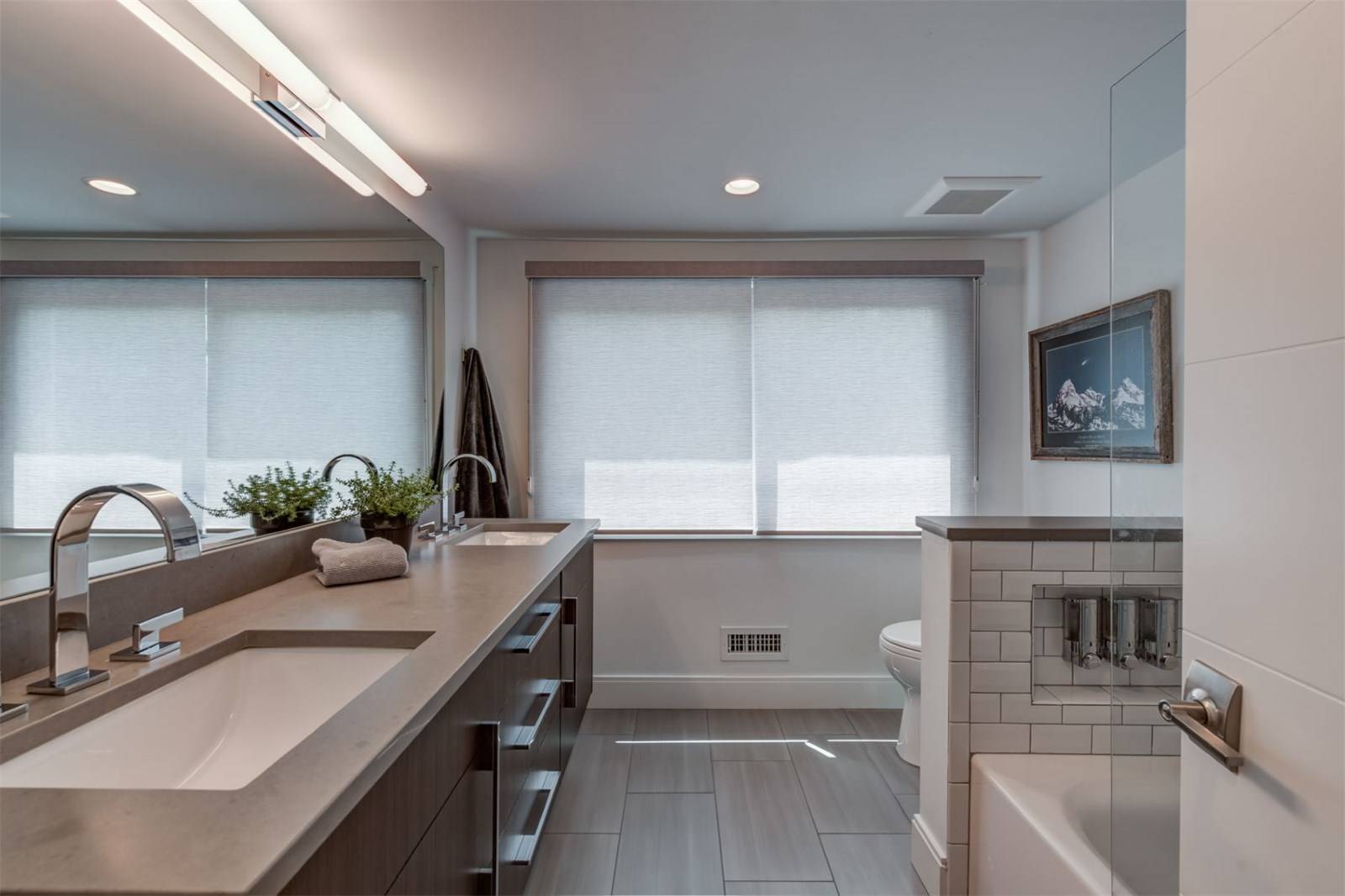
Tile tile everywhere. Floor to ceiling, literally. Everything had to go. The busyness of the previous design had the homeowners longing for something simple and clean. I think we achieved it.
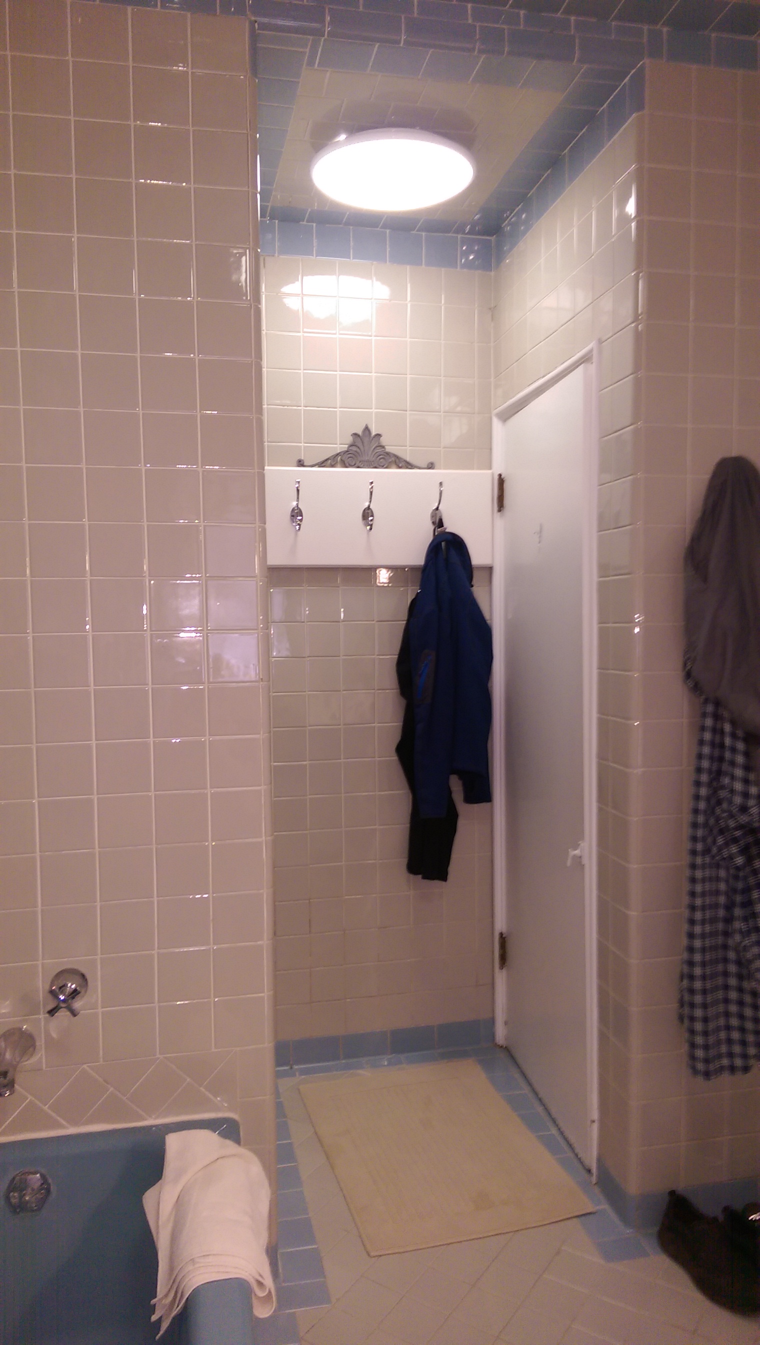
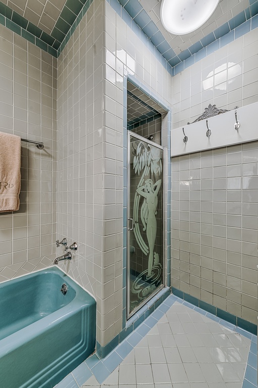
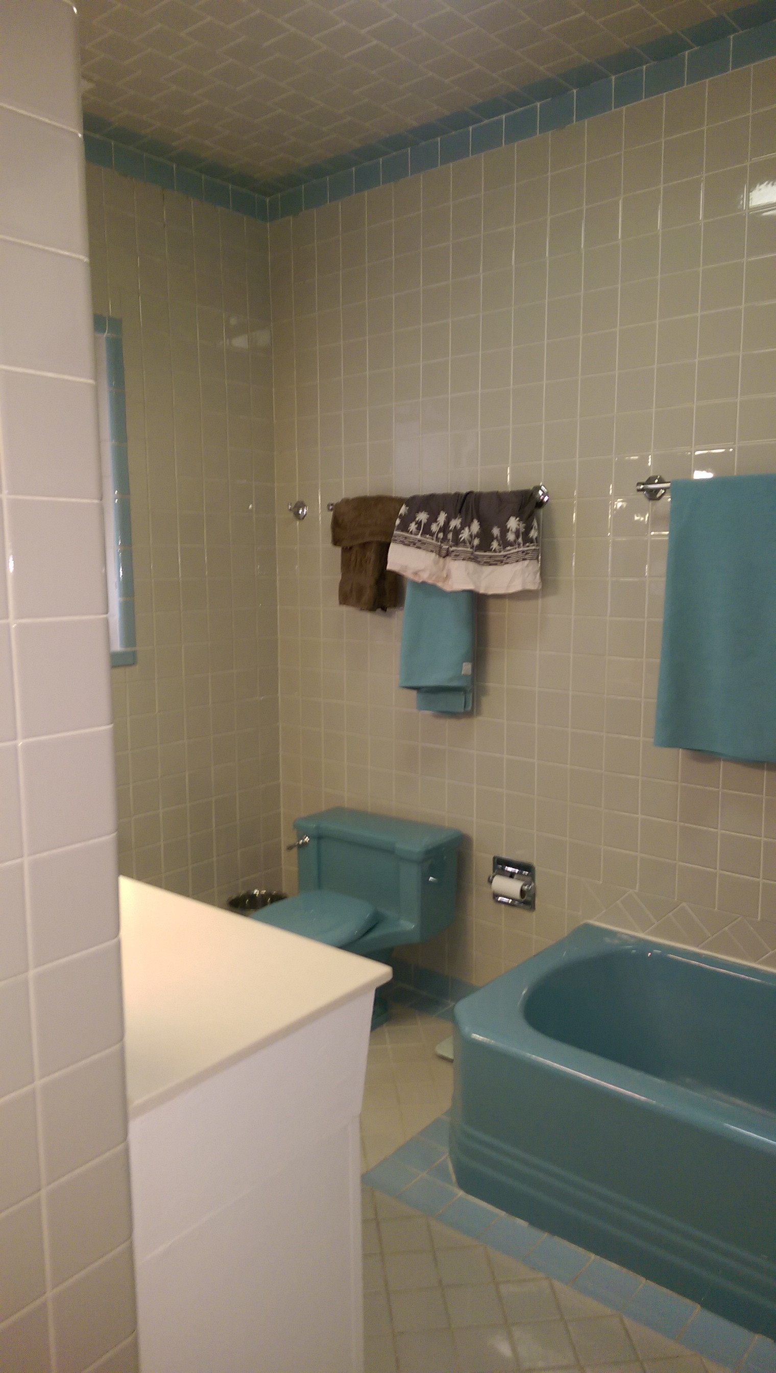
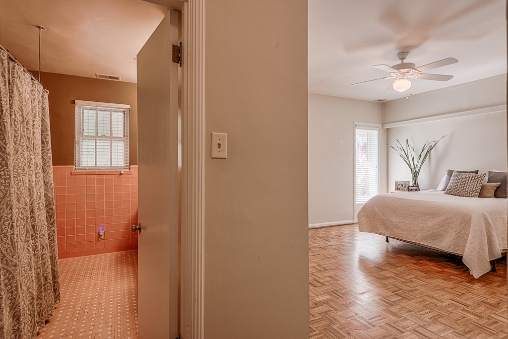
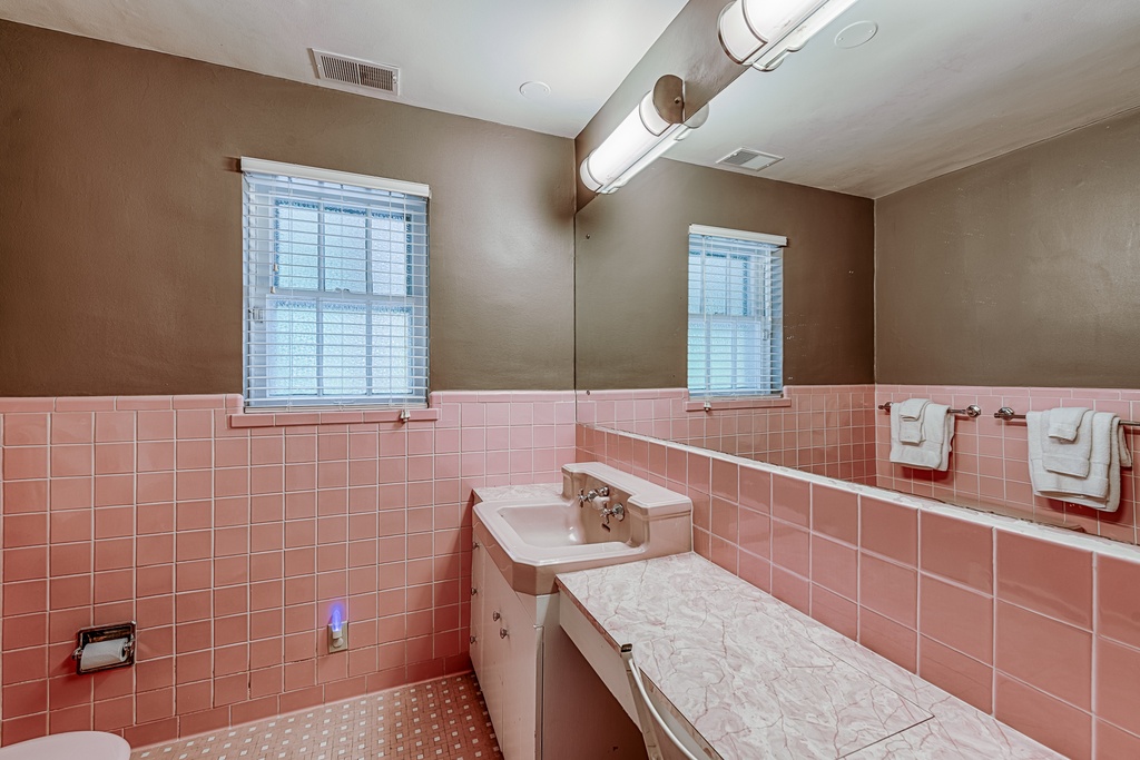
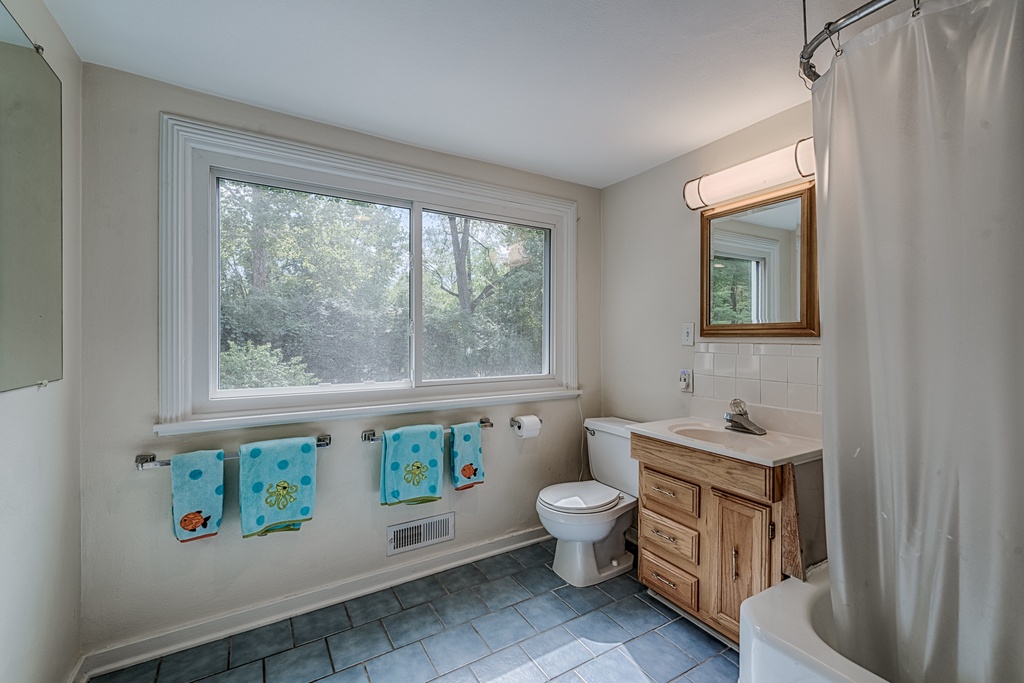
Who knew "millennial pink" would come back right after we ripped it out of this guest bath. People, if colored tile scares you, just sit with it for 50 years or so and it's bound to come back into fashion. Although we missed the boat with this one, I think the finished product will also stand the test of time.
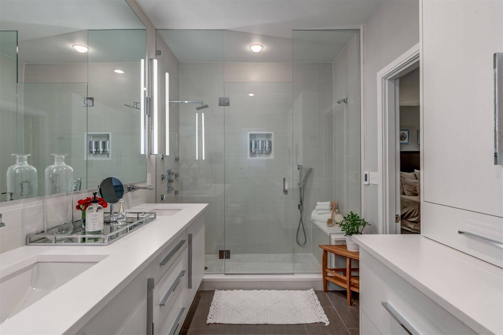
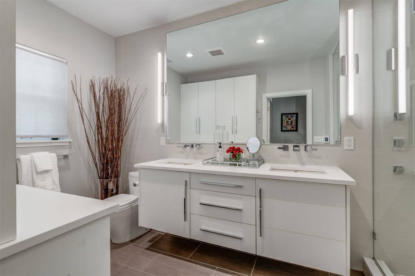
The upstairs bath required some re-arranging of the vanity to make better use of the space and allowed us to add a double sink.
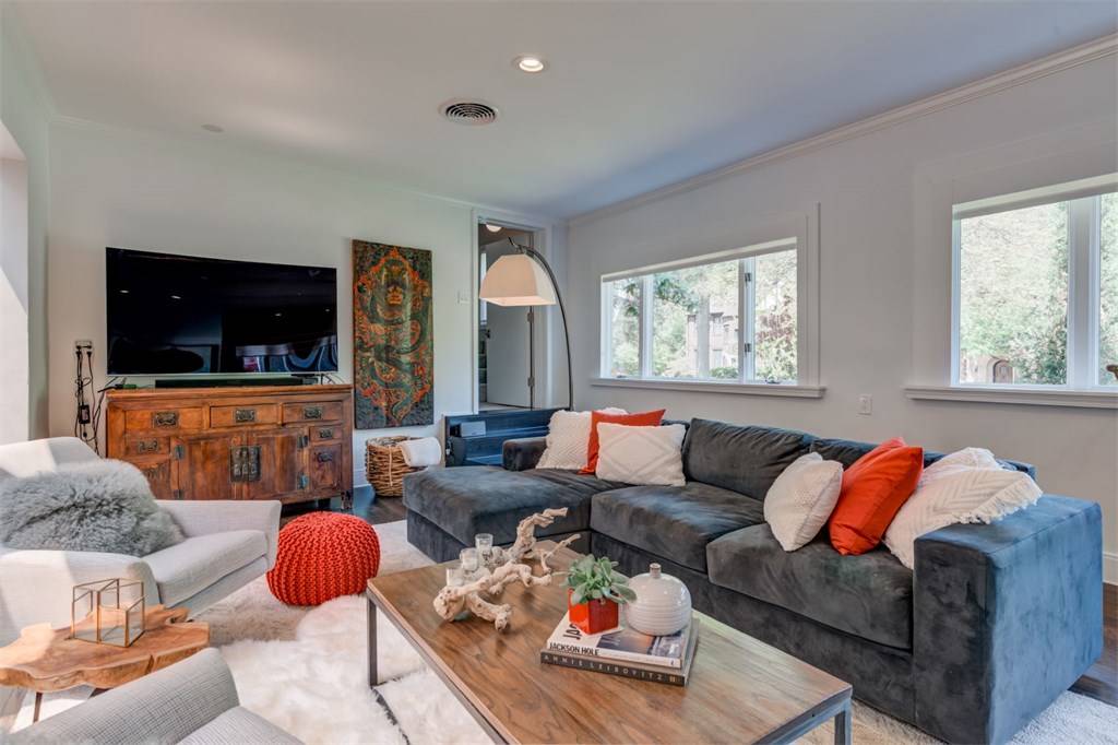
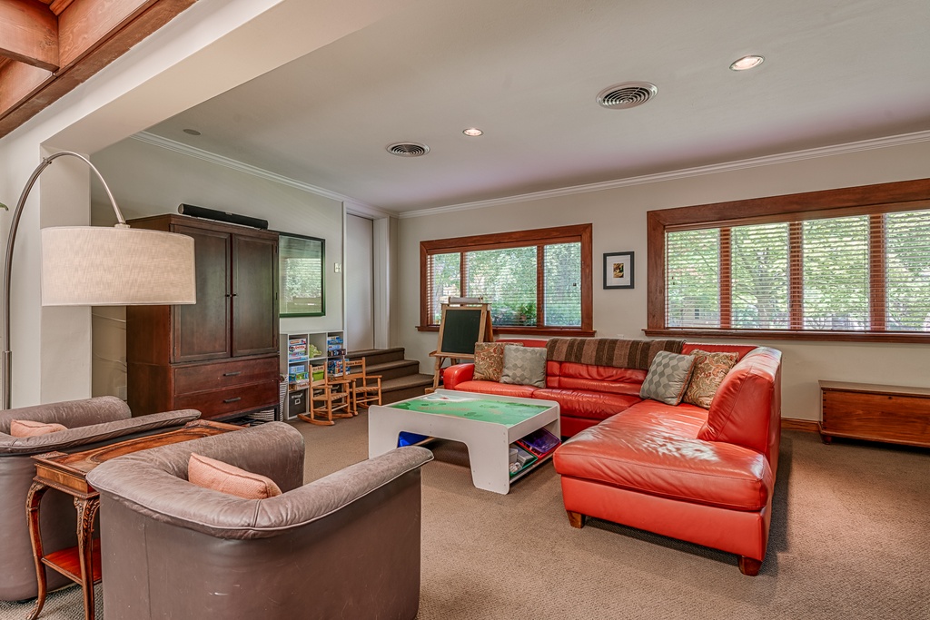
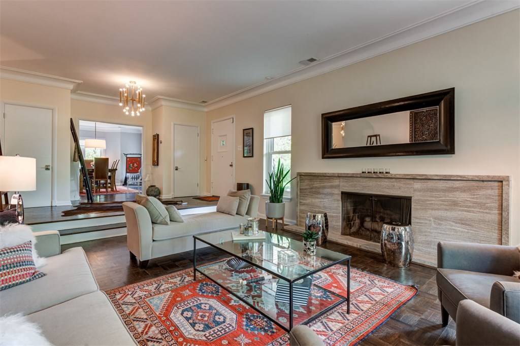
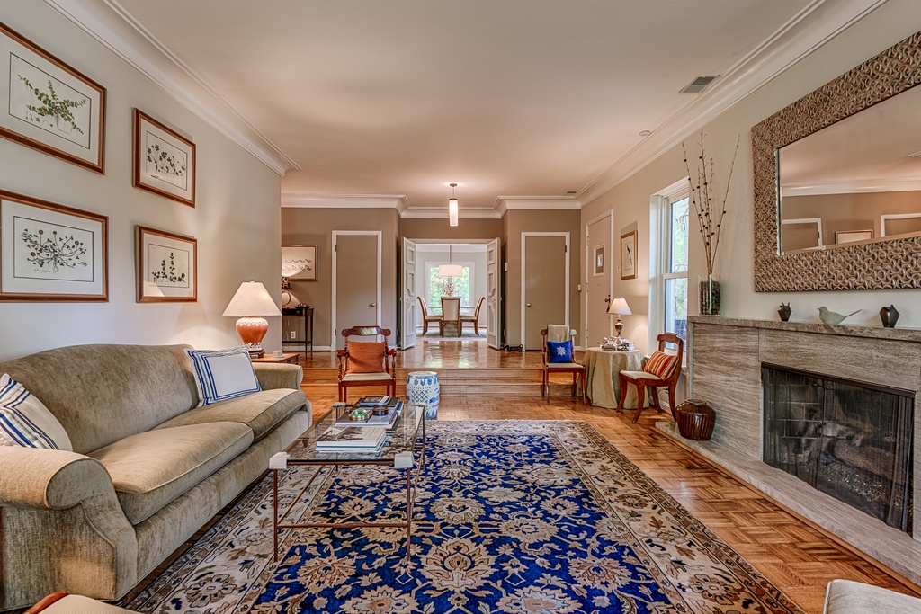
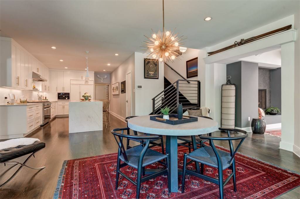
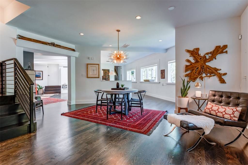
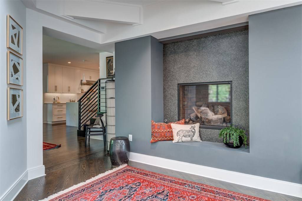
The rest of the images are not my doing. The before and afters tell the story of the impeccable taste of the homeowners. They have traveled the world and picked up some beautiful pieces along the way creating an eclectic vibe that looks professionally designed. "Your home should tell the story of who you are and what you love" and this home certainly does.